
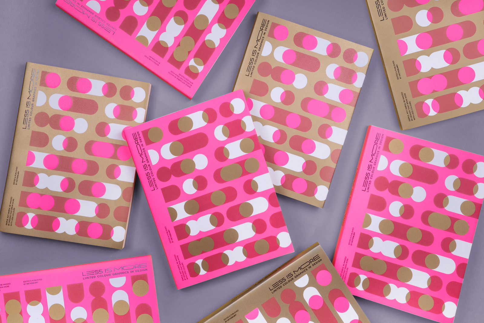
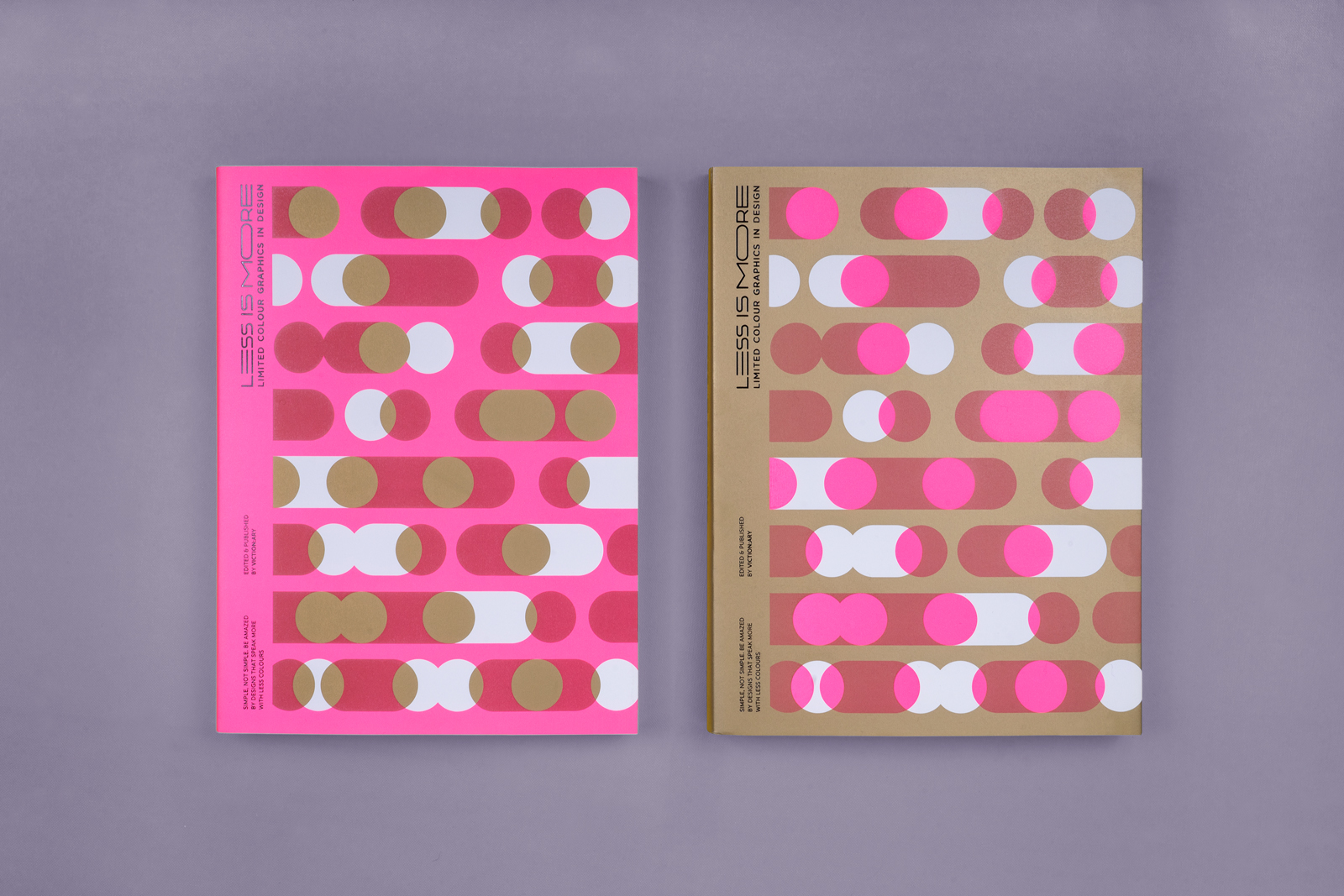

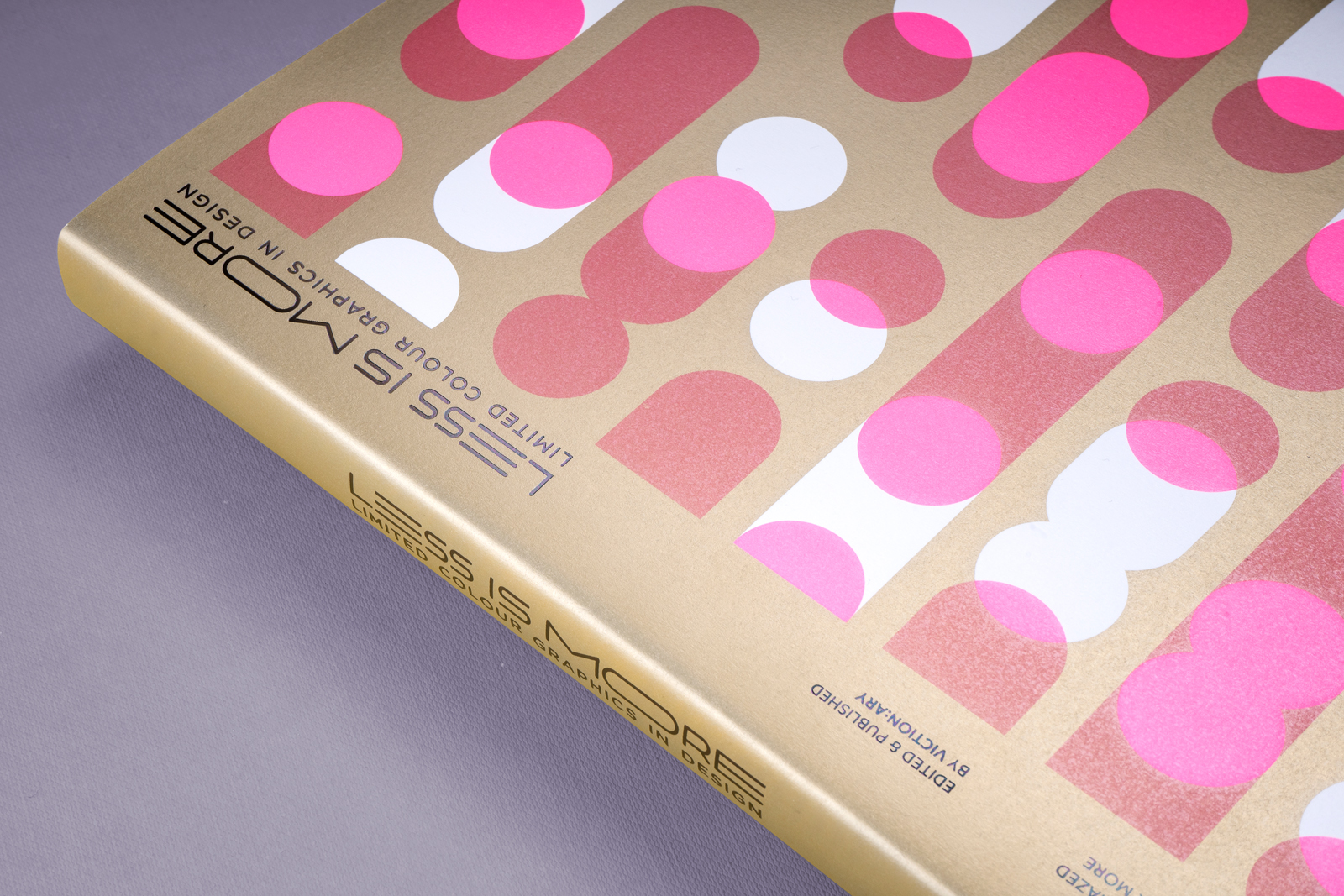
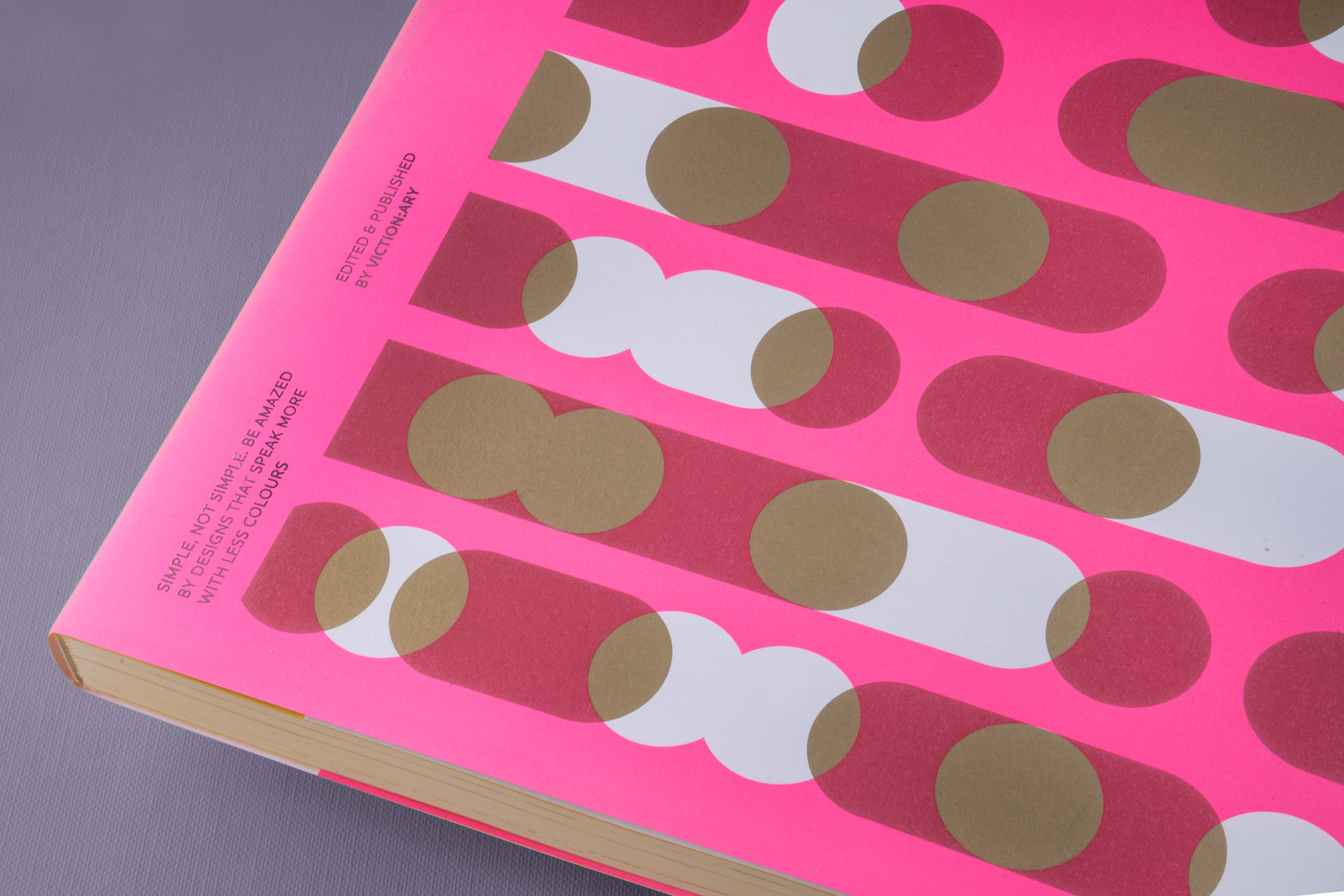

Less is More
- Category Book Design
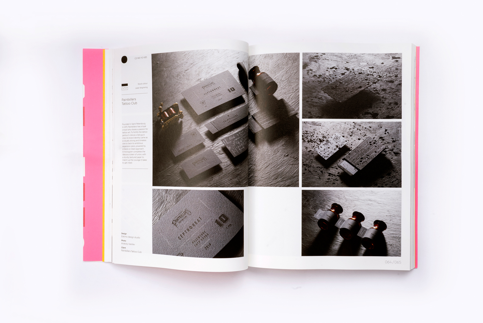
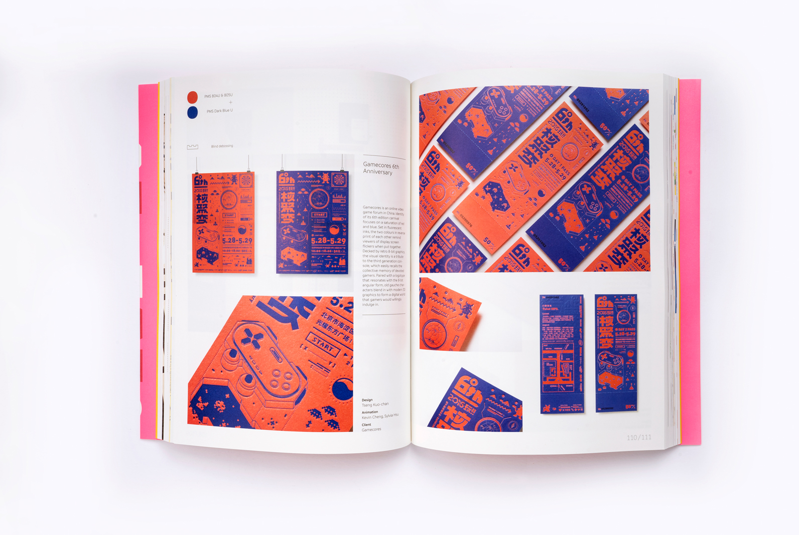
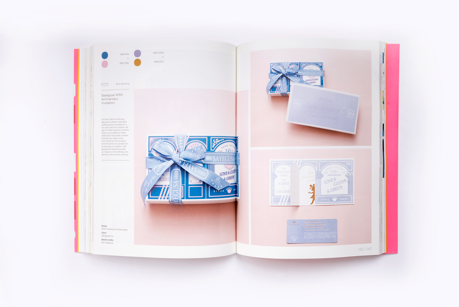
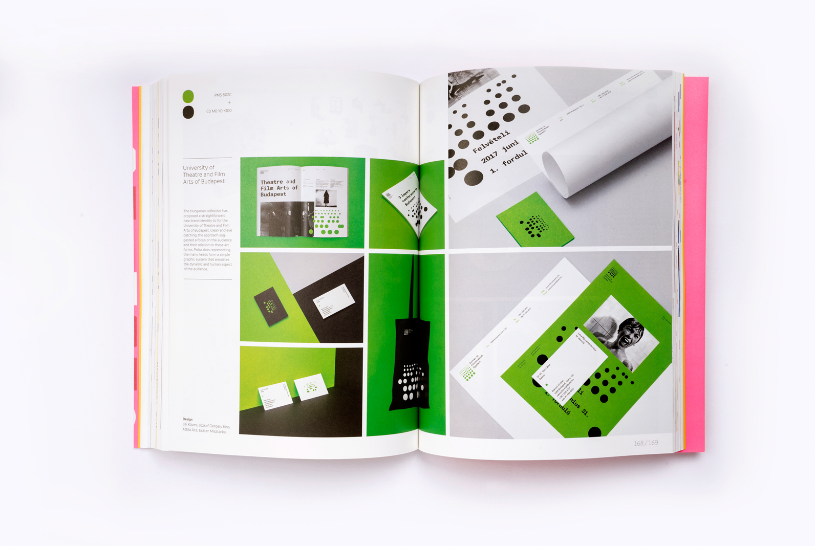
Today’s printing technology allows colour to bloom in profusion on virtually any kinds of communication materials. Amidst the sea of colourful chaos, a stream of cutting edge visual identities proves that reducing their palette is one effective way to get a message across. From fashion labels, music festivals to weddings, these brands and individuals around the world speak aloud as they transmit values in a simple palette. It’s overwhelming to see how intricate ideas unfold in layers by other means — through textures, structure, layers and form.
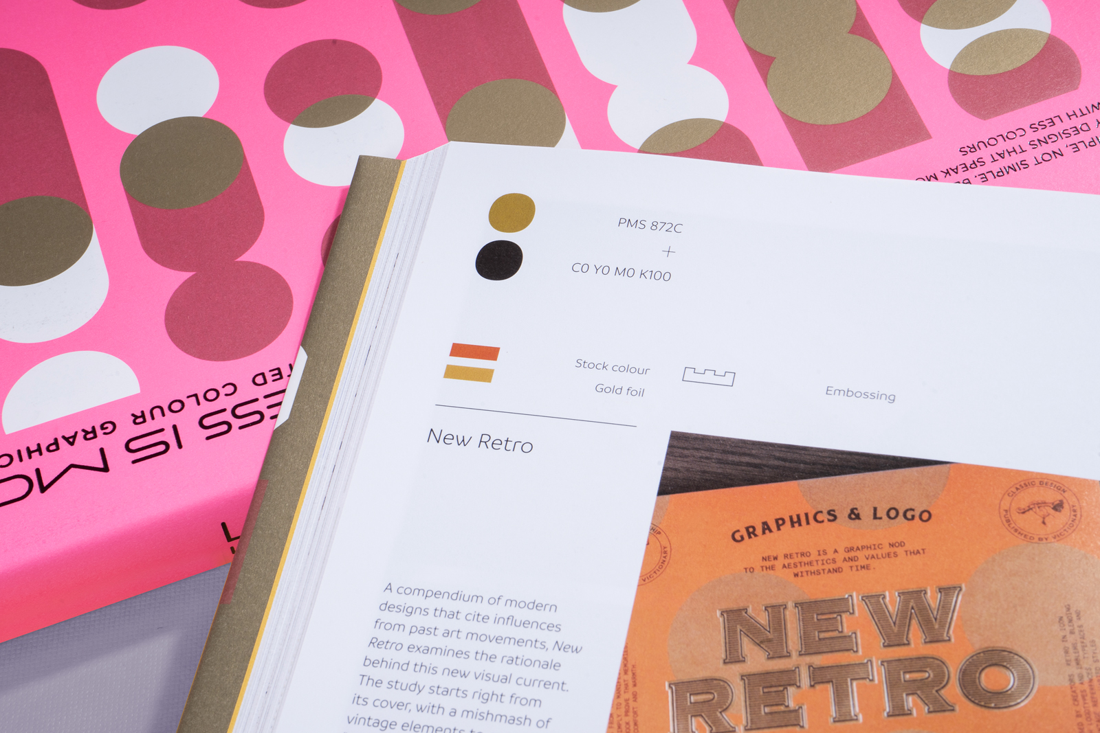
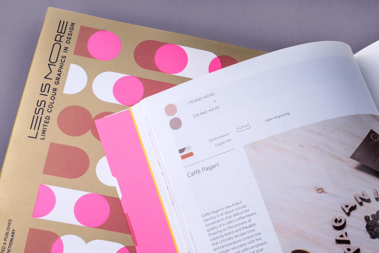
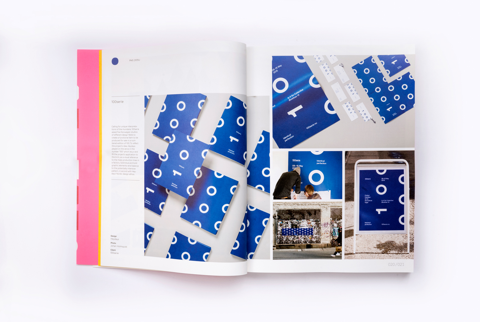
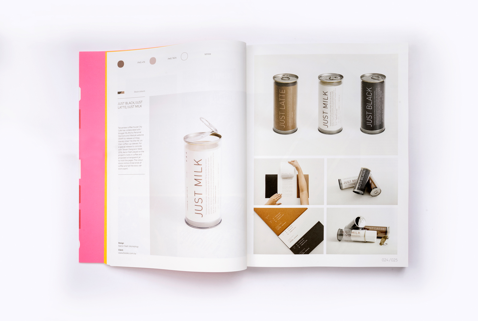
Less is More collates about 120 projects that use only a few colours to attract the eye. In three chapters, categorised by the number of colour inks applied, these creative solutions or visual experiments represent a refreshing departure from mainstream designs that play with selective colour formulations, materials, special printing and graphic details and make a unique appeal. They are tailored for clean and effective brand identities, packaging designs, publications and events, large and small. Whether it is for affordability, visual economy, a non-existing colour stock, or a tribute to modernist art, it is a proof that designs can speak more with less.
Buy this book here
Published and distributed by
viction workshop ltd
© 2017 viction workshop ltd. All rights reserved.
- Category Book Design